Edwin Prakoso over at CAD Notes recently posted a few tips on how to make your Revit presentation views look more engaging and interesting. Here are my top 4 from his top 10:
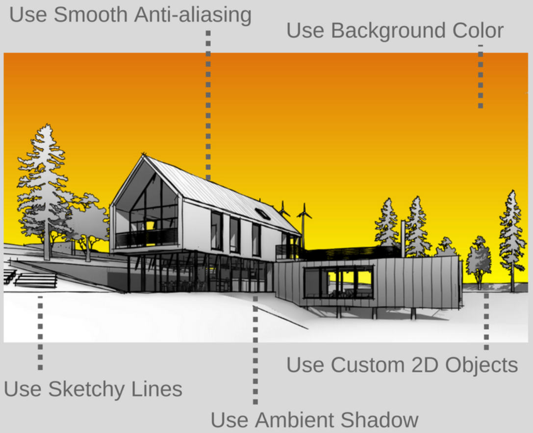
- Use ambient shadow. It gives more impact … and makes sure your view doesn’t look flat.
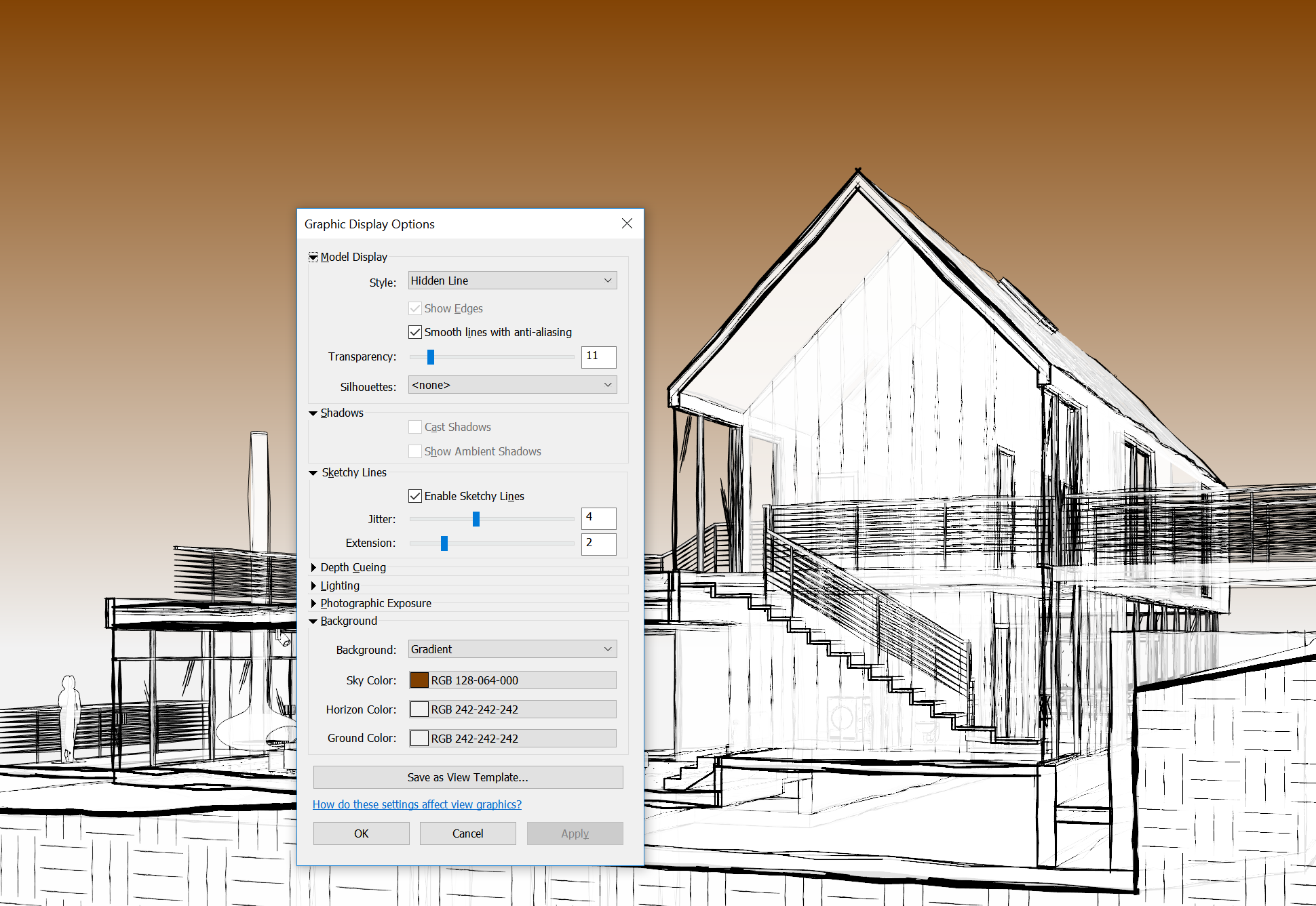
- Use sketchy lines. Hand drawing images often look very artistic and interesting. You can achieve the similar effect by using this option.
- Enable Smooth Anti-aliasing. It gives great impact when you use sketchy lines option.
- Use background color. You can play with the background color to make it stand out.
One that I would add would be to add a little bit of Transparency. See some example settings below:


Source post: https://www.cad-notes.com/10-revit-hacks-to-make-your-revit-view-compelling/
Do you have any tips to make your Revit views look better? Feel free to comment here.