Wow, Revit is starting to finally allow some actual customization of the User Interface!
If you intend to use the Quick Access Toolbar a lot, have a look at the new things you can do – such as sorting the icons…
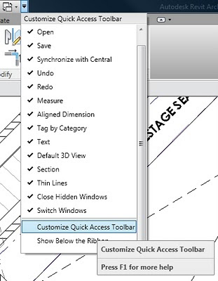
Put your most used shortcuts to the far right of the QAT – this is closer to the centre of the drawing window.
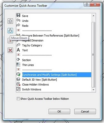
As with 2010, you can move the QAT below the Ribbon if you like.
I fear the day that the Revit UI adopts a tool like the CUI manager from AutoCAD. Keep it simple!
